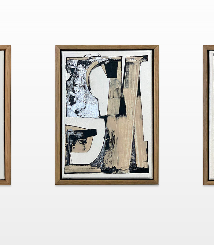
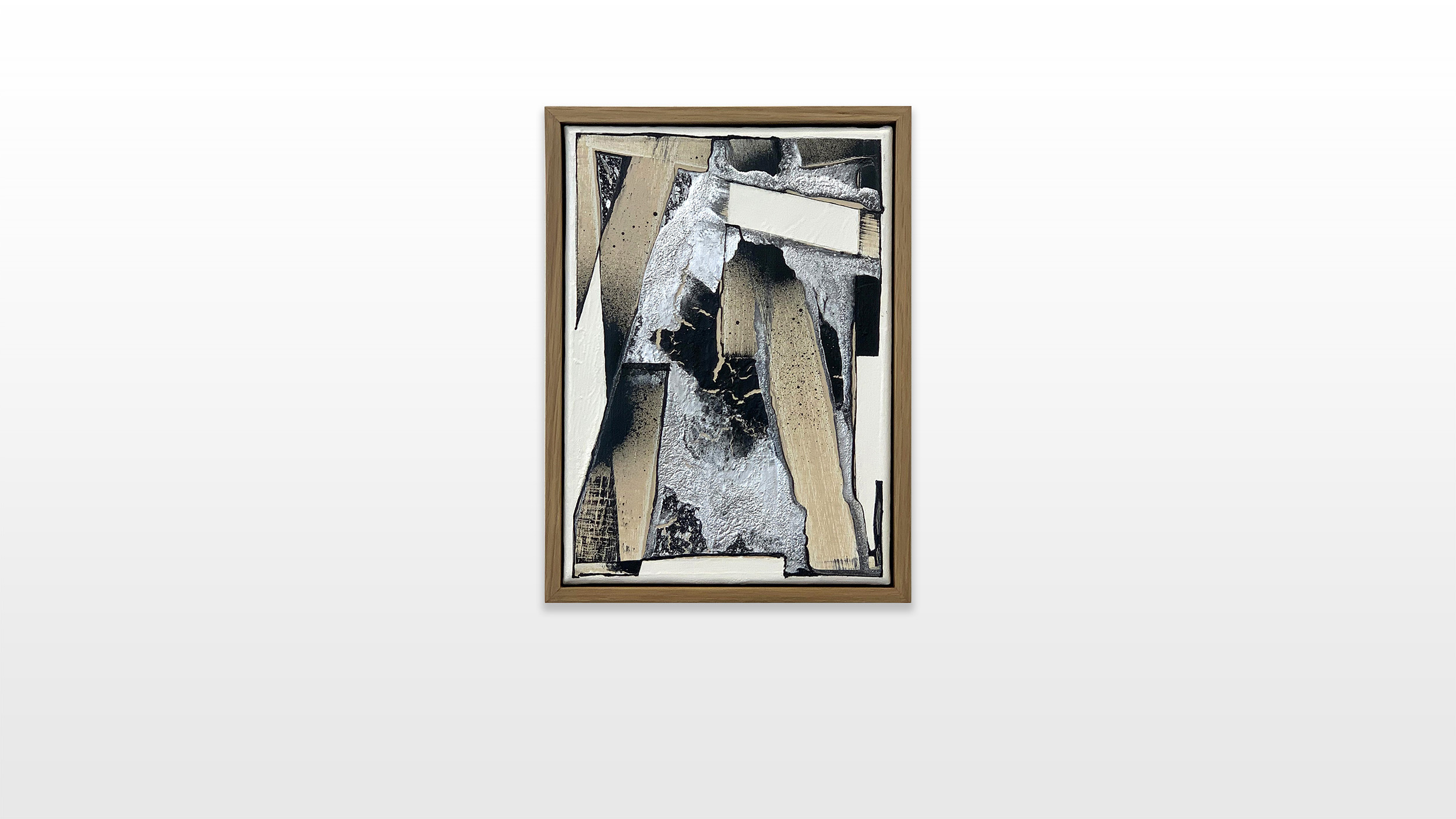
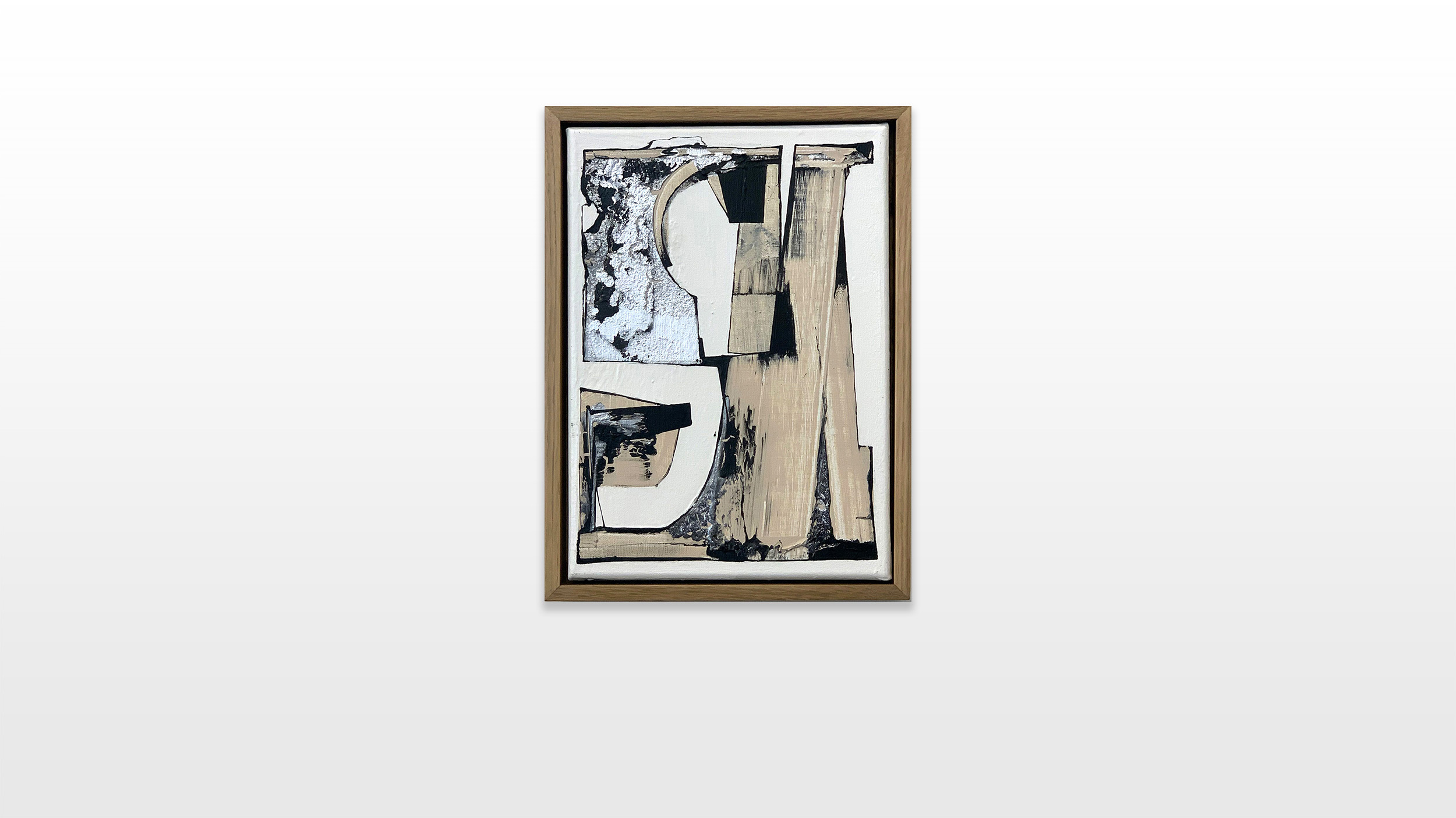
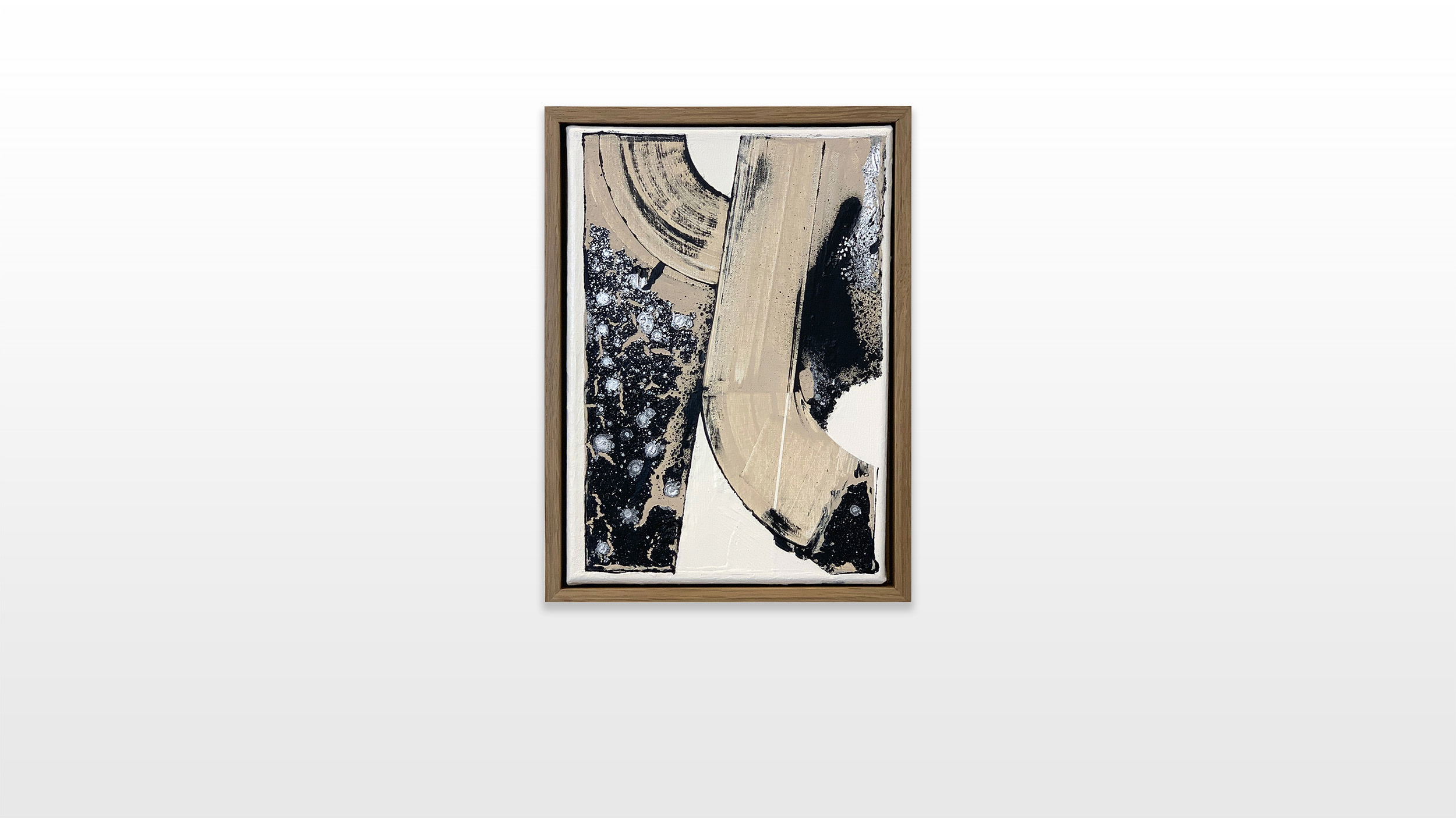
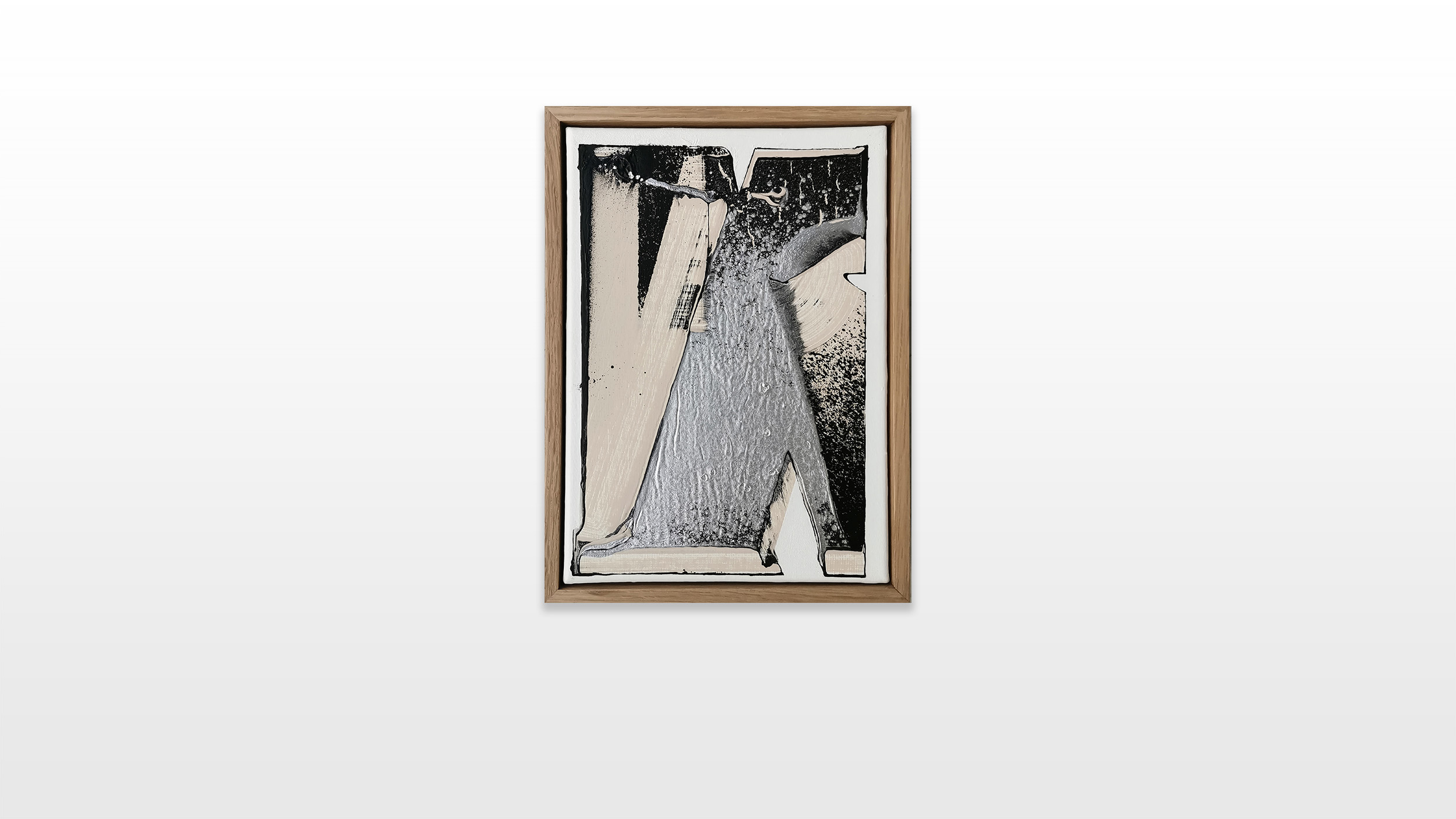
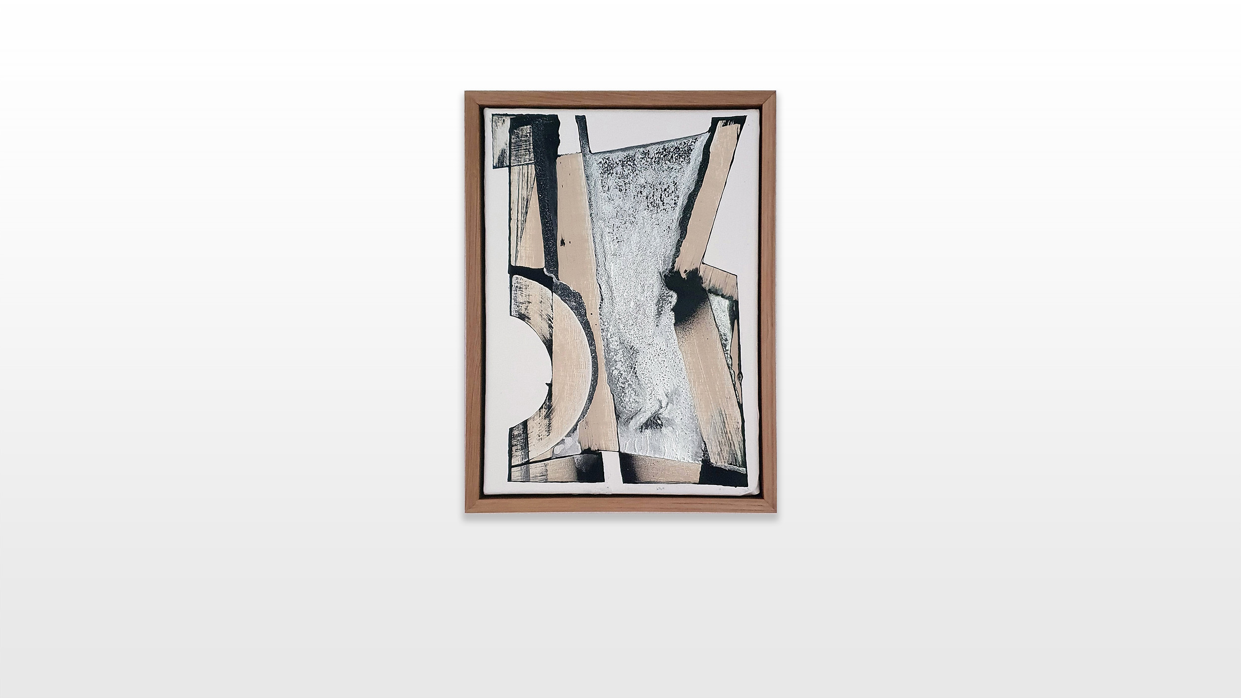
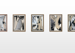
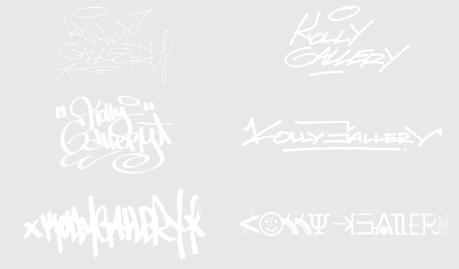
The color choices of his current series are directly inspired by graffiti. Beige represents restoration paint, whose neutrality is particularly interesting to the artist. In fact, he realized that the neutral colors, beiges, off-whites and light grays are associated in “our” (western) latitudes with cleanness, save environment and high living standard, which additionally acts as societal and cultural marker. The seemingly neutral non-colours are also used by cleaning institutions to paint over graffiti or tags. Chrome is an obvious borrowing from graffiti. Its ability to cover all types of surfaces as well as its silvery, light-reflecting shade gives every graffiti an incomparable visual effectiveness. Therefore the chrome and black color combination has imposed itself as a must. The white backgrounds in L’outsiders art works emphasize the architectural balance between his forms and shapes.
Readable versus unreadable, visible versus invisible, function as the great poles of L’outsider’s artistic research. By taking away the readability of the letters, the artist tries to synthesize the dynamics and force without juxtaposing them directly. L’outsiders artistic approach focuses on the aesthetics of letters and therefore he pursues their formal and pictorial qualities, which he states as Abstraction Typographique 2.
Tania di Brita
